Problem
In active tourism, people often decide on their phone in minutes. They needed a site that shows trip offers immediately and leads to booking, without template clutter in the menu.
Case study · Delivery
Tourism / Landing Page
The site should sell trips before the season: visitors need to know where they are, what you offer, and how to book. No analytics numbers here: the client is happy with the result and shares the link with guests.
In active tourism, people often decide on their phone in minutes. They needed a site that shows trip offers immediately and leads to booking, without template clutter in the menu.
A landing with a strong hero, separate routes, pricing, and area sections, plus clear booking CTAs. Visuals matched the local rental brand.
A responsive site with a clear offer and a simple path to booking: a link the client is happy to share with guests.
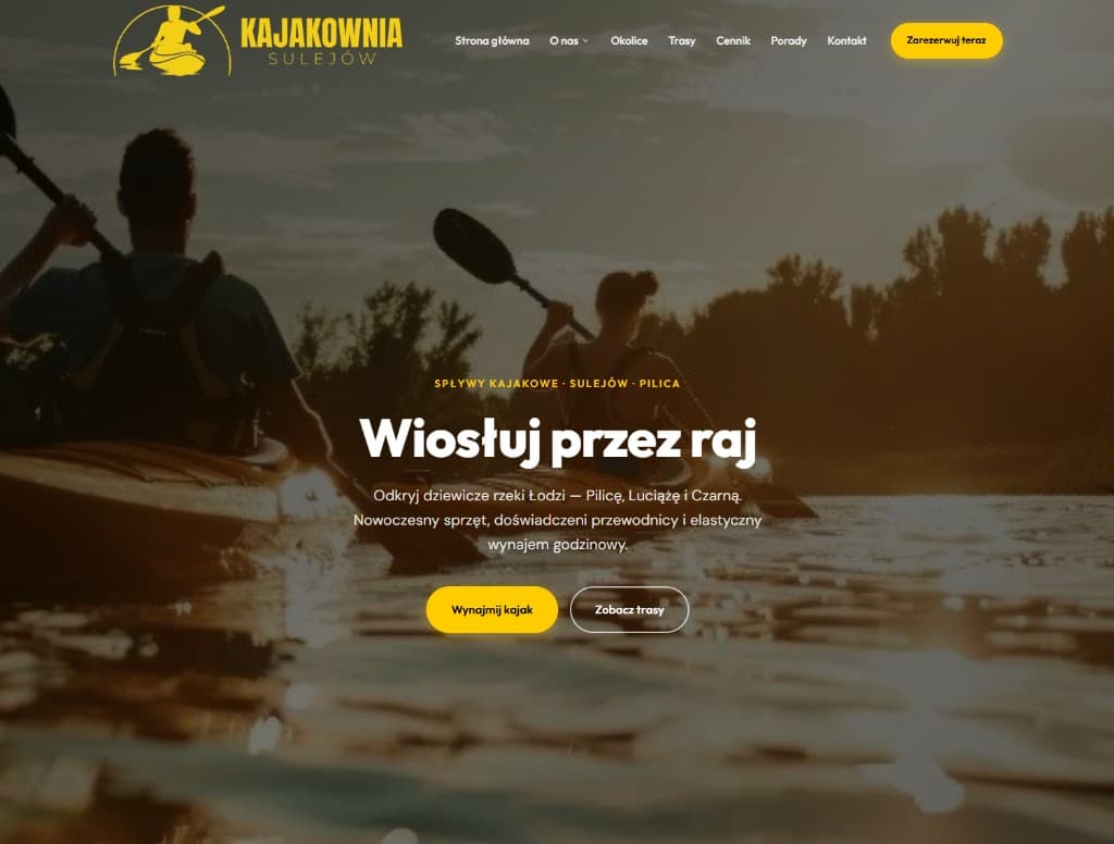
In active tourism, first impression and a fast decision matter. People often arrive on mobile, compare offers in minutes, then call or leave.
They needed a landing that does not look like a generic rental template. It should show the place and lead to contact without menu overload.
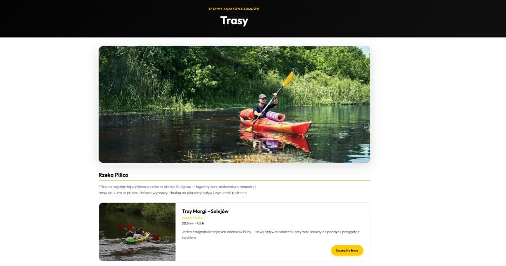
Strong hero photography, short Polish copy, and clear action buttons. Colours and type match the local brand, not a generic template.
Routes, pricing, and the area guide each have their own section. Everything is clearer and in the right place, so guests do not get lost in the menu.
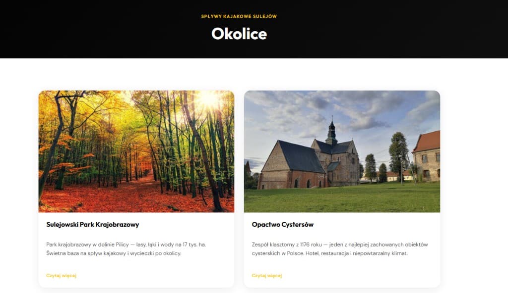
The client has a site they can link in a message or post on social, without explaining “click here, then there”.
We do not publish made-up enquiry growth percentages. There is a live product and positive feedback; that matches the goal: more serious trip enquiries.
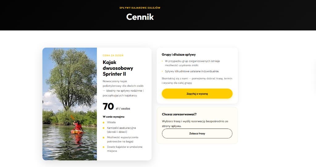
“The site captures the vibe of the trips and finally leads people to booking. Exactly what we wanted.”
No fake KPIs: concrete things visible on the site and in client feedback. Everything is clearer and in the right place:
Send your site URL or tell me about the project; I will reply with a short review and a next step.
All case studies